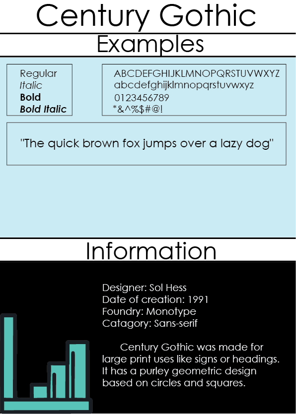
 The font was originally made to be a simple geometric design for large print. I would use this font for a scientific report or something where the main attraction is the information on the page. I chose this font because of how simple it was and I wanted to portray that using the Text Specimen.
0 Comments
 This is far from my first use of Adobe Illustrator, in-fact I am already certified in the program. I didn't learn anything new but it was still fun to do. I blew through it in about 6 minutes and didn't need to follow the video that much. It is different from photoshop as this feels more like drawing or painting than the industrial feel of photoshop. I do want to get a job using illustrator, so that is where I see myself in the future.
I began deciding how I wanted to decorate my tank, I decided on a pink cat theme due to it being based of the German "Maus." I liked how creative I could be, I could make my tank look realistic or goofy. Easiest part was getting the UWV map. while the hardest was lining everything up and trying to get stuff not to warp. Unwrapping stuff is something we do in math class so this project can help then. I learned how unwrapping works and how more advanced models are placed on to objects.
This project was quick to complete. We learned how to properly scale an object to put a bitmap on it and how to change the direction of the bitmap once it was on. We used a multisided preset on the cube before we put everything on it. Lining everything up was as simple as just rearranging each face. Didn't take a whole period to finish.
Learning how to use the material editor was fairly easy, you are simply just putting more modifiers on the objects. Being able to add my own images to the boxes was easy and it was kind of funny adding my face to it and seeing it rendered. This can help you make objects look more realistic by adding texture without having to over model the object. You can add shine or dirt, or just simply change the color. The bump map made everything pop, which was cool and gave my item texture without that much extra work. It was much more simple than I thought, and it was fun. Overall good project.
I learned a lot this year. The highlights being my advancement in photoshop and illustrator. The artworks I have chosen are mostly from those programs and I wanted to showcase them to document the growth I have displayed throughout the year. Seeing my work improve is starting to motivate me to start doing it more on my own and turn it into something big, I just don't know what yet. I want to continue making artwork, especially for my friends, as there character designs characters. My improvement, this quarter has been good, but it could be better, some of my lines are still visible when I cut out objects and my drawing skills need to be improved, but I have come a long way.
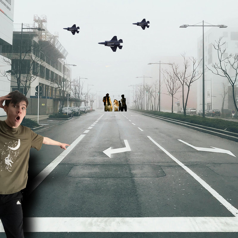 I began this project with taking the picture of myself, I already knew I wanted to do something zombie related, so I decided to a pointing meme related with it. I really liked how creative we could be with this project, there were really no limits on what we could do. The easiest part of this project was layering everything, the hardest was cutting and masking the images. It's not that difficult, just long, didn't help that I was sick while working on it. I used skills from early assignments such as making shadows and masking, helping make the picture look more real. I used these tools because they were simple but worked. I learned how to use composition techniques, which I think will be helpful down the road. To make the project better, I would get better sites to choose images from, school blocked a lot of them.
Photos used:https://www.pexels.com/photo/landscape-photography-of-road-918732/ Landscape Photography of RoadMarcio Henrique https://www.pexels.com/photo/f-35-fighter-jet-in-air-15322664/F-35 Fighter Jet in AirSipal Photographyhttps://www.pexels.com/photo/zombie-inside-an-abandoned-building-5435551/ cottonbro studioZombie inside an Abandoned Building 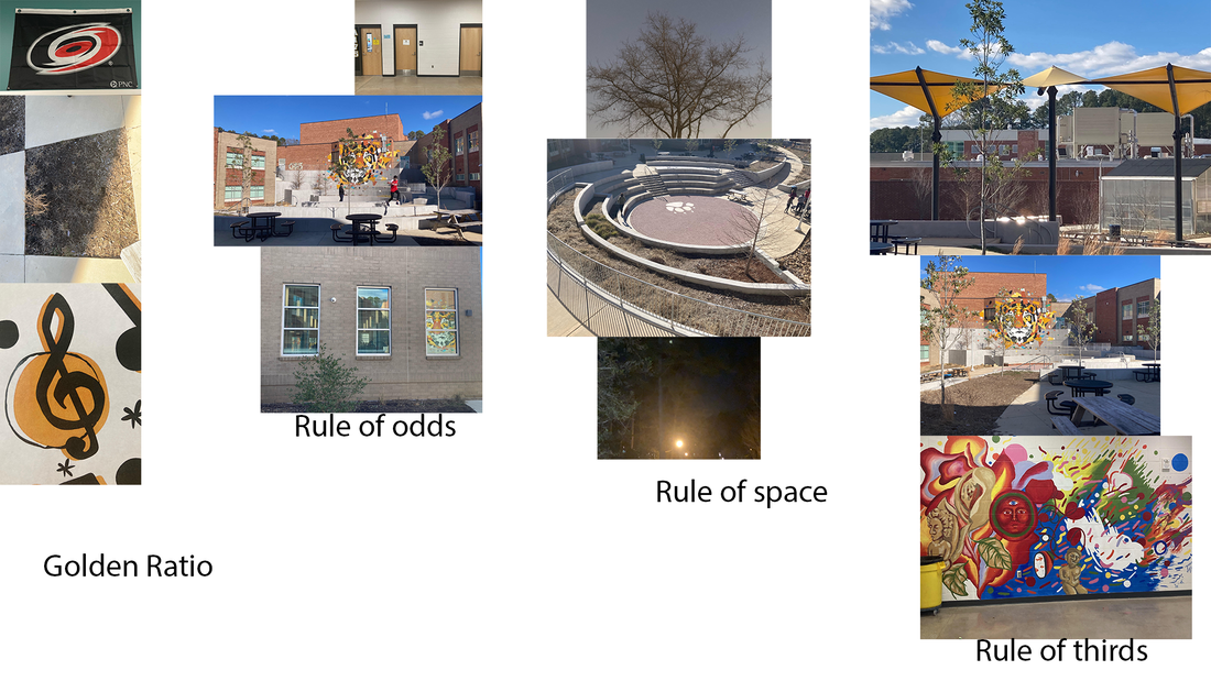 For this project I needed to take 3 pictures showing each technique for composition. I will be going over each one of said rules.
Golden Ratio: To put it simply, golden ratio is a shape where each section is 1/3 bigger than the next, this is typically found in nature. Picture one shows the hurricanes hockey team logo. Each color in that logo gets smaller by about 1/3 for each section as you move. The second picture shows growth of plants in the same pattern. The third picture of the music note has the same process for the bottom of the note looping and getting smaller. Rule of odds: This rule states that the human eye is more attracted to odd numbers, usually 3. Each of these pictures has 3 objects as its center focus, being doors, trees, and windows respectively. Rule of space: This rule states that you should separate your focus object from everything else. You want to isolate it from anything else in the picture. The tree is all alone with only the sky behind it. The patio is empty ( I was photobombed though) And the streetlamp stands by itself. Rule of thirds: This rule states that your focus objects should fall apon certain lines, 3 vertical and 3 horizontal. The objects shout either be at the intersecting points or be along the line. Each main object in the pictures falls on that line. I choose the colors I did as they are the main colors for each of the 3 Bayonetta games. Red, blue, and then purple. I think the colors kind of changed how each one feels. The first 2 are polar opposites and the next one looks more like a nice blend between the two. Monochromatic feels singular. Commentary feels like the character is trying to be 2 people at once. And Analogous feels like they took the best traits from the first 2 and put them together. Overall, this project was fun if not a little bit challenging. I love how the 3rd one came out, looks a lot cleaner than the rest. 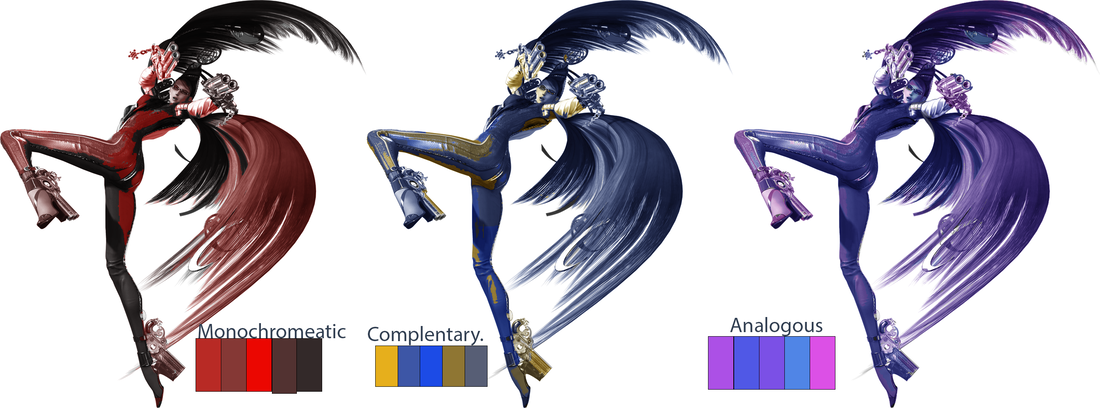 I played many color theory games to, well learn colour theory. I was pretty good at it! One of the games I didn't know how to play one of them so I didn't do so well. But I did ace one of the games. I have heard horror stories about people trying to learn color theory, but it wasn't that bad. It should help me make my own art this semester. Here are my scores, try to beat them! |
Author15 year old student digital artist. Archives
May 2024
Categories |
 RSS Feed
