|
I choose the colors I did as they are the main colors for each of the 3 Bayonetta games. Red, blue, and then purple. I think the colors kind of changed how each one feels. The first 2 are polar opposites and the next one looks more like a nice blend between the two. Monochromatic feels singular. Commentary feels like the character is trying to be 2 people at once. And Analogous feels like they took the best traits from the first 2 and put them together. Overall, this project was fun if not a little bit challenging. I love how the 3rd one came out, looks a lot cleaner than the rest. 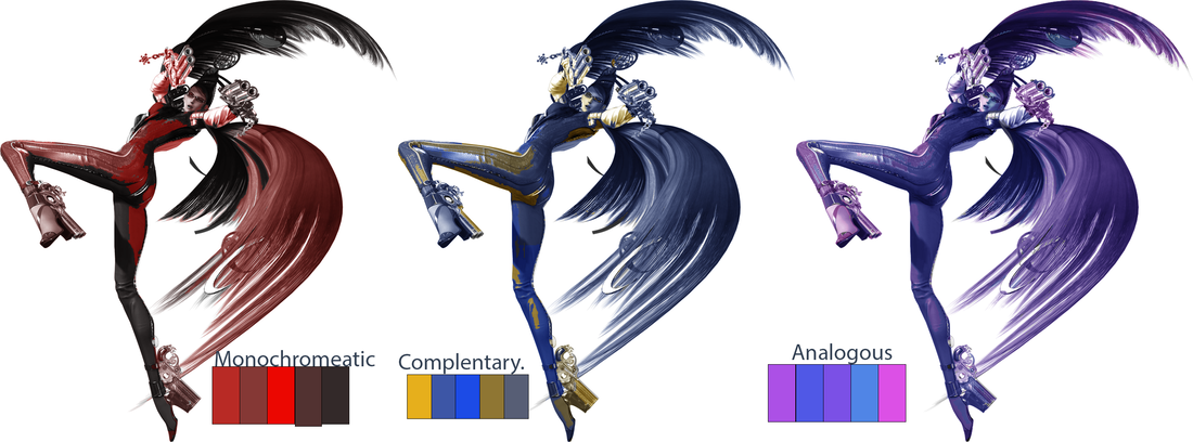
0 Comments
|
Author15 year old student digital artist. Archives
May 2024
Categories |
 RSS Feed
