4 Corners landscape
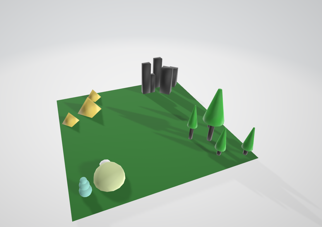
Basic building project, nothing that hard or challenging. Make shape then put shape in place.
Personal Video Project
|
|
I had a LOT of fun with this project. I got to figure out how to record gameplay, edit encoding settings and solve a bunch of issues. My first step was to create the intro and then grab gameplay footage from there. Everything else was just linking stuff together. But that didn't mean it was hard. I spent about an hour getting footage, then another 6 hours editing all of it. It took a long time, I had to fix audio issues, make sure I could actually encode the video, fix problems with the various programs I used. But I overcame them. Audio I just either boosted the audio or switched programs. For encoding it was a simple setting change. Program problems just required updating, but getting the footage was a pain due to the replay feature only being able to be used once. My solution was to just get good, which actually worked. My video is over the run time limit, but that's because I had a LOT of fun doing this project. There are still some problems present in the video, but I believe I can fix those with time and work, this is my first constraint free project.
Lights and Camera 4 corners.
|
In this assignment I learned how to position lighting and make it move to seem like time is passing. I also learned how to use cameras to get different perspectives. The hardest part was getting the lights to be in the correct place and color at the time they are supposed to, the easiest part was setting up the cameras. I wish I could improve how the lighting changes, looks to artificial for my liking.
|
|
Animated 4 corners.
Animating wasn't that hard. All you had to do was set it to follow the road path, which was easy. The only thing I would like to improve is the quality of the video as it is stuck at a grainy 360p. Other than that I did the assignment just how it was posted.
Menu
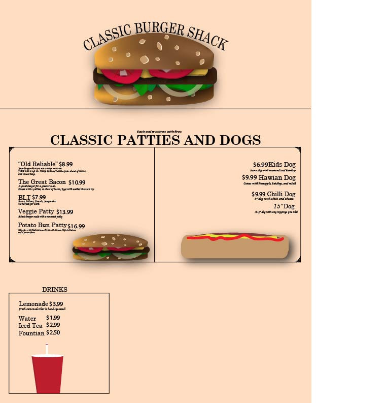
I learned more about drop shadows when we did this activity. I have already done stuff in illustrator for another class so most of the tools I already knew, but drop shadow makes my objects pop out more and I like it. I used 3 fonts/typefaces for this project. Two were used to convey classiness and a old timey feeling while still being readable, and the other was used for prices so they would be easier to read. I created a Hot dog by putting 3 cylinders on top of each other then using the drawing tool to add mustard and ketchup. The Drink I used a pen tool for the body, and a cylinder for the cap and straw. I wanted to menu to look like a piece of old parchment, so I added a layer behind everything and made it a tan/yellowish color.
Storyboard
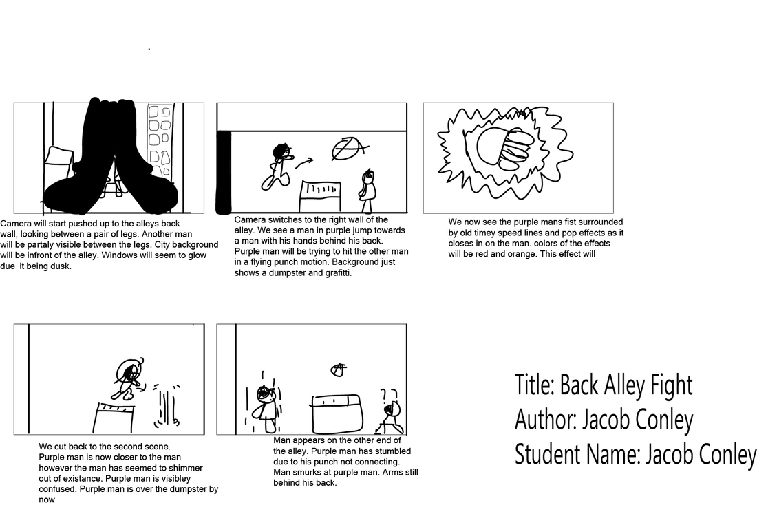
I wanted to introduce my characters quickly and in an exciting way. So I decided to do a fight scene. I wanted the readers to know each characters personality without having to speak a word. I wanted to make purple man seem tactical and stealthy, so I made the scene take place in an ally. I also wanted to make the other man cocky and smug, so I wanted him not to react to purple man until the last second. I am very much into anime currently, so I wanted to do the old effects and speed lines in my storyboard. I wanted the camera angles to feel like a videogame, so I went for the in-between legs shot at the beginning, then switched to a 2d platformer camera for the rest.
Design Matrix Challenge Elements
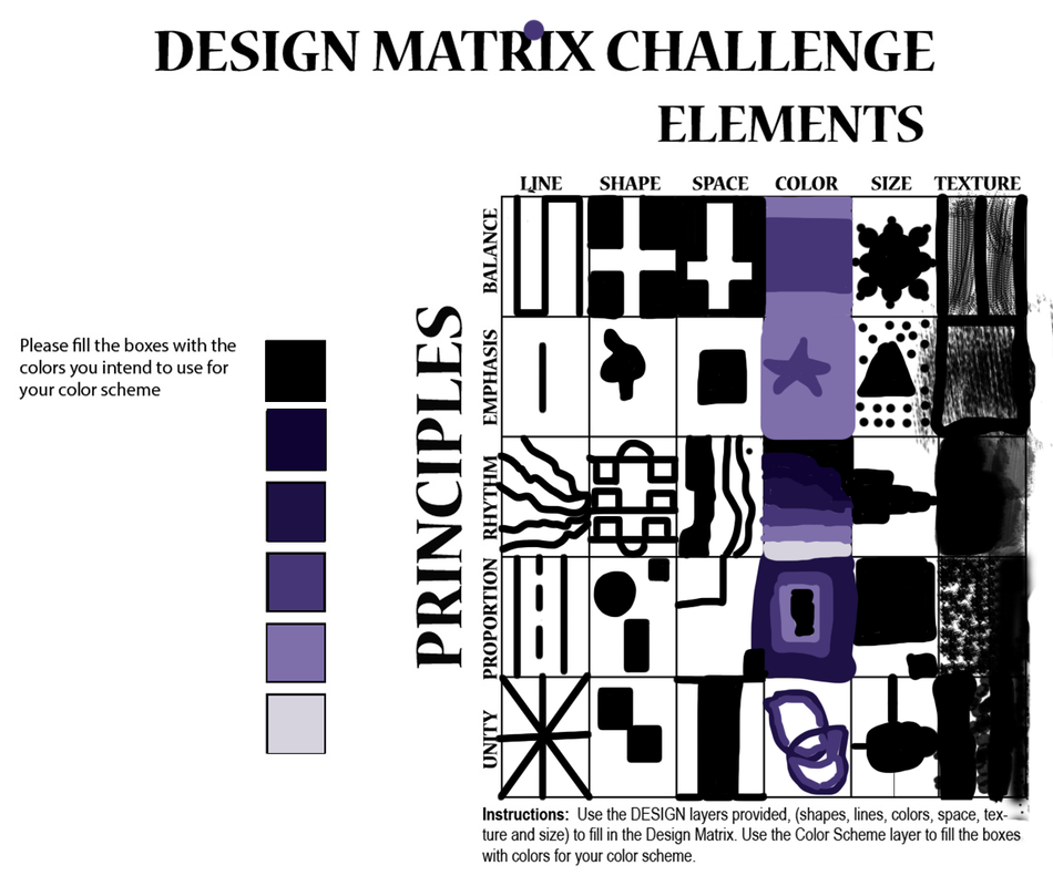
This project was tricky in my opinion. Trying to use all the elements into a single principle was hard, but I believe I did it. For balance, I wanted it to be equal on all sides whenever I used an element, so I decided to make symmetrical patterns for it. I wanted it to feel like it could stand up on its own. For Emphasis, I wanted there to be one big thing that your eyes are immediately drawn to. So I decided to do a big object or shape in the middle for them. For Rhythm I wanted my drawings to feel like music notes or noise. So I made them either all come from 1 direction, look like sound waves, or tried to make them look like a music sheet. Proportion I wanted to make one thing look bigger than the other, so I simply went for a of variety sizes. Finally for unity, I wanted to make everything become one single object, a continuous feeling, so I connected each thing I drew for that section.
Overall, this was tricky and required lots of thinking, but it was fun and allowed me to express my creativity.
Overall, this was tricky and required lots of thinking, but it was fun and allowed me to express my creativity.
Character Design
For my first character, I wanted him to look strong and be a noble fighter. I decided to choose green and red as I thought it would contrast nicely. The 2 main colors representing how he wants to be and how he goes about doing it. I gave him underclothing to round everything out. A white shirt for some balance, and a reddish brown belt and pants to mix both of my main colors together. If I were to put him in an animation, I want him to be kind and carrying, but with a rough side. I would like his movements to be jagged and rough most times to show power and excitement, but smooth his design and himself out when he is emotional or trying to help someone out.
My second character I made a mysterious roguelike figure. I wanted to practice my shading so I decided to give him a hood and make some shadows that covered his eyes. I went for purple as my main color because I believe it shows mystery and such. I also gave him a light violet robe to contrast with the darker colors. If I would put him into a film. I would like him to have smooth. well thought out movements no matter what speed. I believe his behavioral tendencies would be that he doesn't care about what others think of him, and that he would be quiet,
The hardest part of this project for me was the initial pencil sketch, never been good at drawing, and I had a hard time trying to get the correct shapes for my character so I had to erase a lot. I am happy how it came out though. This was my first time creating a character on paper in years and I do think it could have come out worse.
Firefighter Masking.
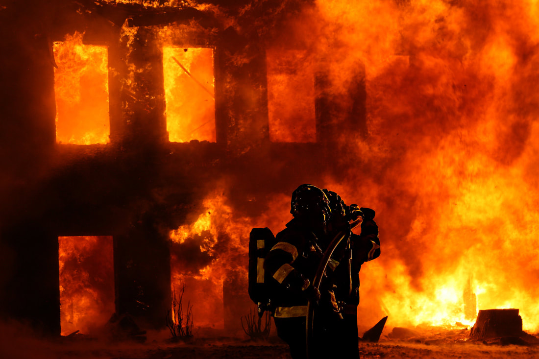
This activity was learning how to use the masking tool along with how to make shadows. It was fun choosing what I wanted to do, I chose a fire fighter because I'm thinking of taking that class next year. The hardest part for me was cutting out the image, it takes awhile to do right and you have to make sure you don't erase the part of the image you are trying to cut out. The shadow wasn't that hard, just make a fill of the object you want to make a shadow of and then make it have a fade on the end. Mine turned out to look very real.
Vignette
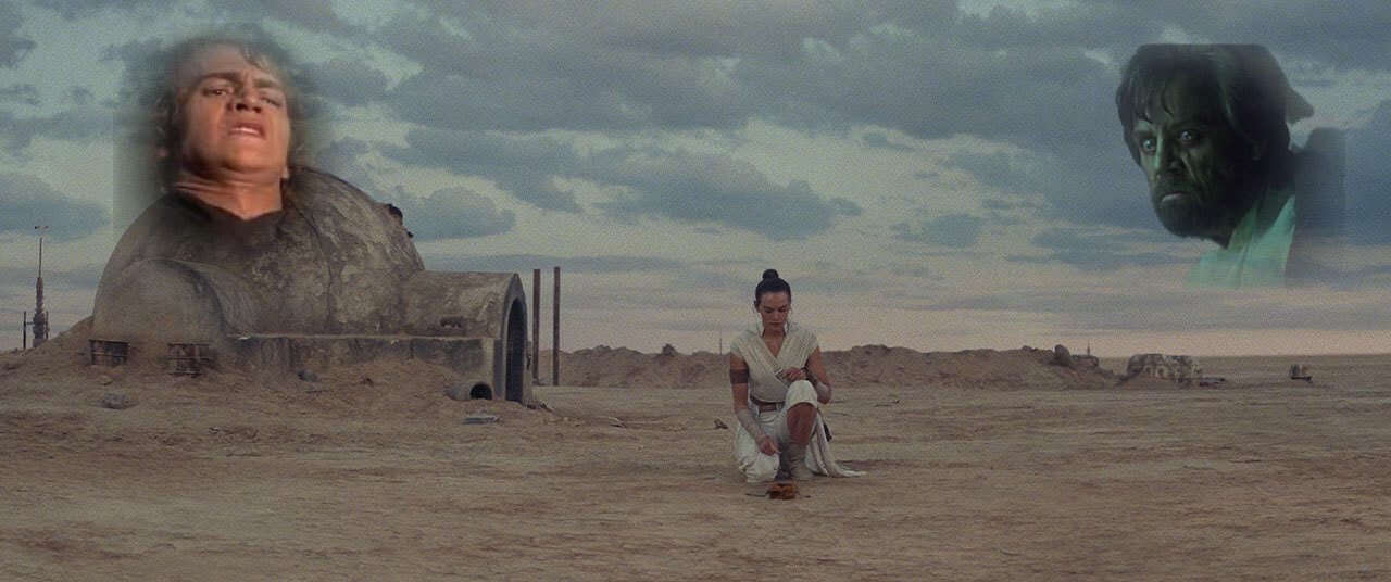
I always hated how Rey buried Luke/Anakin's lightsaber. So I decided to make this Vignette about how the would react if they saw Rey do it. I mostly used the lasso tool for this project. But I did use a remove background tool and masking. For Anakin, it was just using the lasso tool. For Luke, however, I used the lasso tool, a mask, and removing the image background to get rid of the lines and make it look like he's actually in the sky. It made me learn how similar results can be achieved a number of different ways. It also taught me how similar tools do slightly different things.
Screwdriver, Bolt and nut, and wineglass.
I began just by following along with the videos, doing the Bolt, wine glass, then the screwdriver. It was very fun to do. The techniques we used were easy to learn and fun to use, and making the animation taught me a lot about how it worked and it was cool to see the final result. The easiest part of this project was making the cuts for the bolt. Took like 20 seconds and the process was easy. The hardest part was the Screwdriver, trying to get the percentages right for each segment was annoying, along with trying to get the tip to look correct. I am glad I learned these skills though as they are used in a lot of basic modeling. I think I'm going to use the cut feature the most to make holes and pathways in future projects. However, I would like to improve one thing for this project, and that is the videos. One is from 2009 with the audio sounding like a Xbox 360 CoD lobby, not pretty and gave me a headache.
